UX Project: Creative Design Jam
Client: Carrier CorConnect
Location: New York City, NY
Duration: 1 Week

Overview
A design jam is a short, one week sprint to learn, wireframe, and design an application for a potential client. We had a small team consisting of designers and project managers to talk with the client, learn about the current product, and then take that knowledge and create a few screens to show ideas of what is possible. While it was an extremely condensed timeline, we were able to create wireframes, design comps, and an interactive prototype that really wowed the client with innovative thinking using proper user-friendly techniques.

User Groups
Factory Users
Manage the product fleet, troubleshoot distributor issues, identify customer trends, manage distributor territories, and test new products.
Distributors
Troubleshoot dealer issues with the CorConnect system, daily dealer interactions, CorConnect portal assistance
Dealers
Dispatch technicians, provide remote customer & technician assistance, and identify available opportunities for new products
Timeline
Our team had one week to complete this project. We started with a knowledge session on the current state of the portal and its users, used design thinking methods to develop a solution, and used quick iterations to sketch, wireframe, and design rapidly.

The Project
The following descriptions and images are in the order that we started working on the project. We began with a knowledge transfer meeting with the client, were we took notes, whiteboarded features to include, and started our initial sketching to validate our ideas. We then moved quickly into low fidelity wireframes, which we presented to the client to validate our approach and ensure that we were covering everything in the requirements. From there, we had very little interaction with the client, and proceeded to make our low fidelity wires into high fidelity wires, finally handing them over to the visual team to make them look amazing. Our final presentation was on Friday, and after a short, week-long sprint, we had created several visually appealing screens, checked off every requirement, created an interactive prototype in Invision, and really impressed our client and their team.

Notes & Sketches
Knowledge Transfer Session
We met with the client first thing Monday morning to talk about the current product, what features the client envisioned to include, and then had a quick brainstorming session as a team to start ideating.
Features to Include
- Alert Notifications
- Finding Customers
- Fault History and Descriptions
- Email Alerts
- System Status Alerts
- Notifications and Event Logs
- Critical Alerts
- Configuration of Customer Devices
- Remote Troubleshooting
- Equipment Setup

Low Fidelity Wires
Validating Ideas
After meeting with the client, we had a brief 4 hours to start going through all of the information that was presented to us, organize the information in a way that would make the product more efficient and user-friendly, and start sketching. We created some quick low fidelity wireframes to start validating our ideas, and presented to the client on Monday afternoon.
Goals for this Stage
- Become more knowledgeable about the material
- Validate our current ideas
- Ensure we were on the right path for the user persona details
- Start to think about innovative ways to improve the experience

High Fidelity Wireframes
Adding Details
After validating our ideas with the client, we started to add more details to the low fidelity wireframes to create these high fidelity wireframes. This helped the visual designers figure out how to start designing parts of the page. These wireframes also ensured that we had all of the information that the client requested before getting into the pixel perfect details.
Innovating with Usability in Mind
Our main goals for the wireframes were to:
- Build on what the product already had
- Make the product easier to use
- Ensure every detail on the personas were covered
- Show how we can innovate to create a better product
- Add big picture ideas, such as a community for users that would provide more details the client never thought of yet

Final Visual Designs
Our Ideas Come to Life!
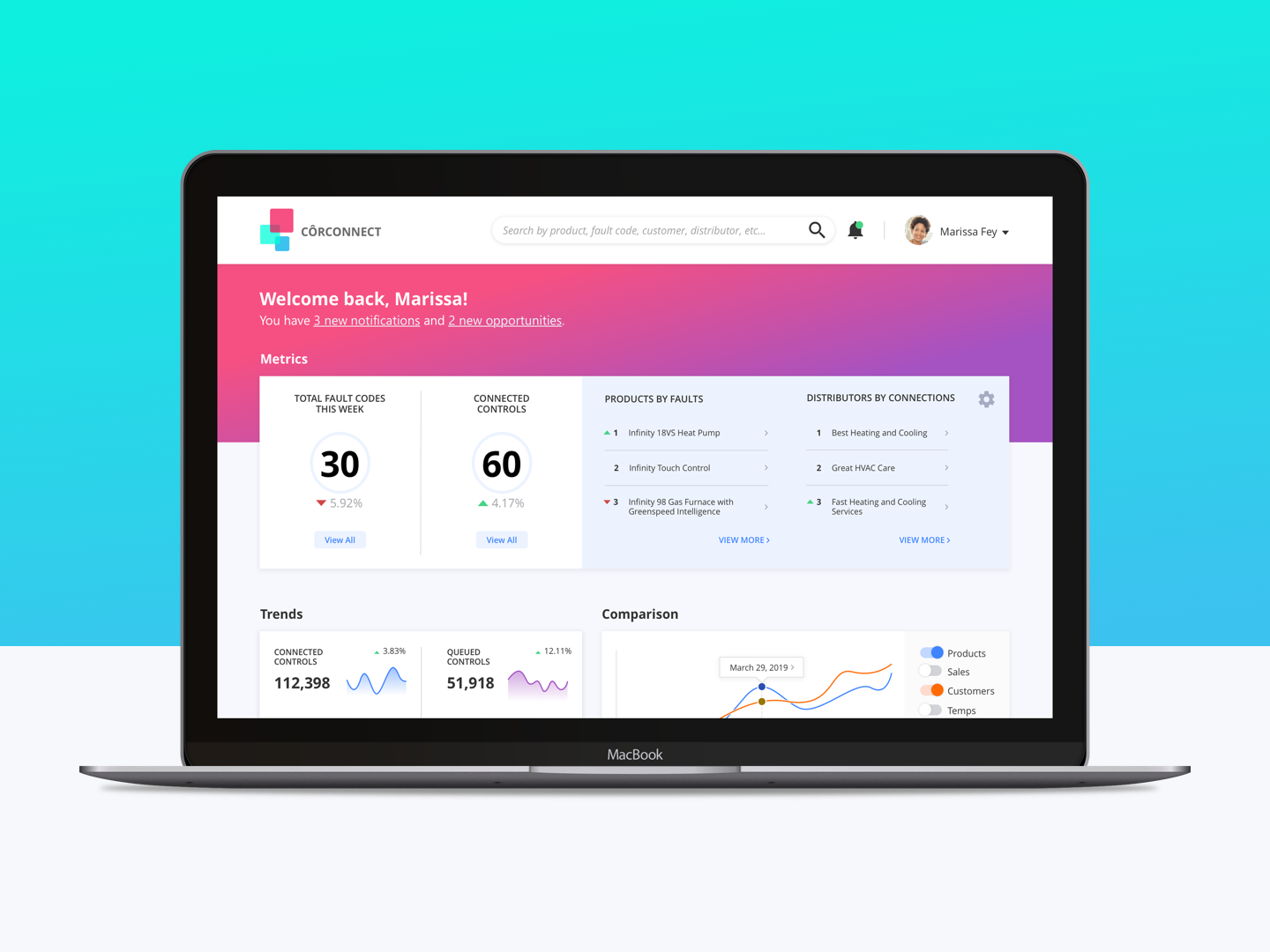
Finally, our visual designers took our high fidelity wireframes to the next level and created this final visual designs for the product. With such a colorful palatte and visual appeal, it would be hard not to want to work on this application every day. We put these designs into an interactive Invision prototype to help tell the story of this application in an interactive way.
Goals for the Designs
- Create components that could be used across the system
- Think about the design according to each user profile
- Make the information visually appealing
- One last chance to get all of the details right
- Team approval and critique before showing to the client
Results
Happy Client, Happy Team!
We presented our final solution on Friday afternoon, to an enthusiastic client and additional team members that came on the call to see what we came up with. While the final designs still need some tweaking, the client was very impressed with our ideas. He said that we came up with some ideas that he never thought of before, and it made him see the product in a new light. As far as our goals were concerned, we were able to showcase our ability to innovate with a limited amount of time and a lot of hard work.
"This design jam has completely changed how I look at the possibilities for our product. I am extremely satisfied with the results of this design session and look forward to implementing these ideas."
- Mark L., Carrier's Product Manager