UX Project: Designing Complex Data Applications in Healthcare
Company: Council for Affordable Quality Healthcare (CAQH)
Location: Washington, DC
Duration: December 2017 - October 2018
Overview
I was assigned to a project that initially tried to build a tool for users without doing proper research, user testing, and user experience design first. While the software had over 1.4 million users out of necessity for the service, the users couldn't properly use the tool. As a result, the call centers started to get overwhelmed with help calls, users became frustrated, and the tool was deemed unusable. That's when my team was brought in.
This project consisted of four portals, a comprehensive design system that gave the system a cohesive design, 8 prototypes in Invision, 300+ screens in Sketch, and multiple iterations to test our final product.
Check out this review by Business Wire on the impact it has had in the industry!
"Our new platform has the power to transform the market and establish a standard solution that eliminates operational friction and latency between groups, providers and health plans. This solution enables the platform to change and grow as the industry’s needs evolve."
- Ron Urwongse, CAQH’s Senior Product Manager
The Goal
Our job was to develop a design system that had four basic qualities:

Self-Guided
Users should be able to navigate the tool on their own without engaging support

Simple
Allow users to focus on a single task at a time

Forward Thinking
Develop a responsive design that could be reused and effective in additional projects

Accessible
All elements should pass WCAG 2.0 AA standards
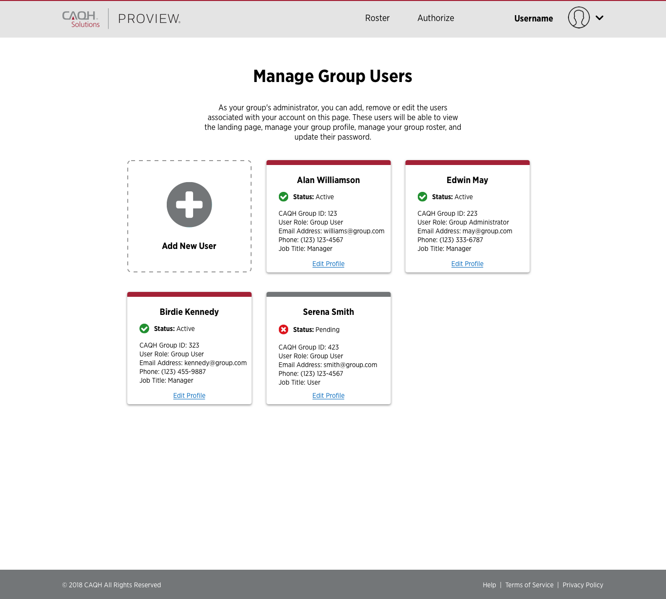
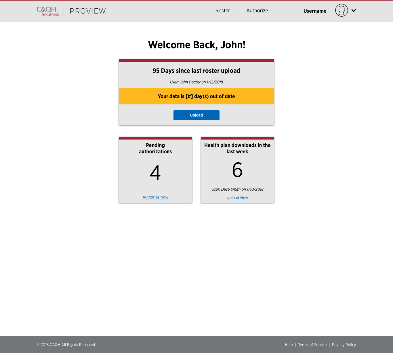
This project consisted of four different portals - provider groups, health plans, credentialing, and operations support - so it had to be able to cover a variety of components while staying true to the design system. Our objective was to develop a system that would improve the overall experience of maintaining provider group, retrieving provider data, making the credentialing process for providers easier, and providing operations staff with a tool that will reduce support calls. This project was especially interesting because of the large amounts of data we had to work with, as well as the complex processes that users had to go through to upload information for their providers. As we all know, the health care system can definitely use some work, and this project took just a small part of the frustration for providers and hospitals and improved these processes!
My Role
I was initially sent out on this project as a user experience designer, responsible for developing the journey maps, wireframes, and prototypes for the project. As different portals were added on, I was given additional responsibilities as other team members rolled off, eventually managing the user experience, visual design, and design system for all projects. Though it was a heavy leadership role, I had a great team to work with and learned a lot along the way.
- User experience designer
- User interface designer
- Interaction designer
- Product designer
| Role | Responsibilities |
|---|---|
| User Experience Design | Developed and managed all sketch resources, which had over 300 screens by the end of the project. I saw the design process from the initial research findings through sketching, wireframing, prototyping, and the live product. |
| User Interface Design | Developed new visual design guidelines that would be reused across all portals in future redesigns. These design decisions were documented in a comprehensive, 20+ page document and a well-organized sketch file that was handed off to the on-site designer. |
| Interaction Design | Created 8 interactive Invision prototypes used by a variety of teams to show the users and stakeholders on the project. These prototypes were also used to show the developers what the end design and interaction would be like. |
| Product Design | Responsible for maintaining a comprehensive overview of the product that could be handed off to business analysts, developers, and stakeholders, while ensuring the product met all business requirements and objectives. |
| Team Leader | Communicate design decisions and business requirements to the development teams. Lead design thinking workshops that explained the latest trends in design and suggested improvements to the tool based on this research. |
The Numbers
1.4M
users currently using the application
300+
screens wireframed, prototyped, and tested
20+
page functionality document that described the design elements for the development team
1
new design system solution to standardize the way we manage data in healthcare
Results
The project launched with great success in the market. Originally used out of necessity, this project has become a staple when managing data for providers in healthcare that users have found to be profoundly helpful in their daily tasks. Users found the new applications to be simple to use, easy to navigate, and has enabled the health care industry to grow. Check out this review by Business Wire on the impact it has had in the industry!
"Through collaboration and innovation, this new platform can accelerate the transformation of business processes to deliver value to providers, groups, health plans and ultimately patients seeking care."
- Mike Bowman, a managing director in Accenture’s Health practice
Looking for more in-depth explanations? Read on!
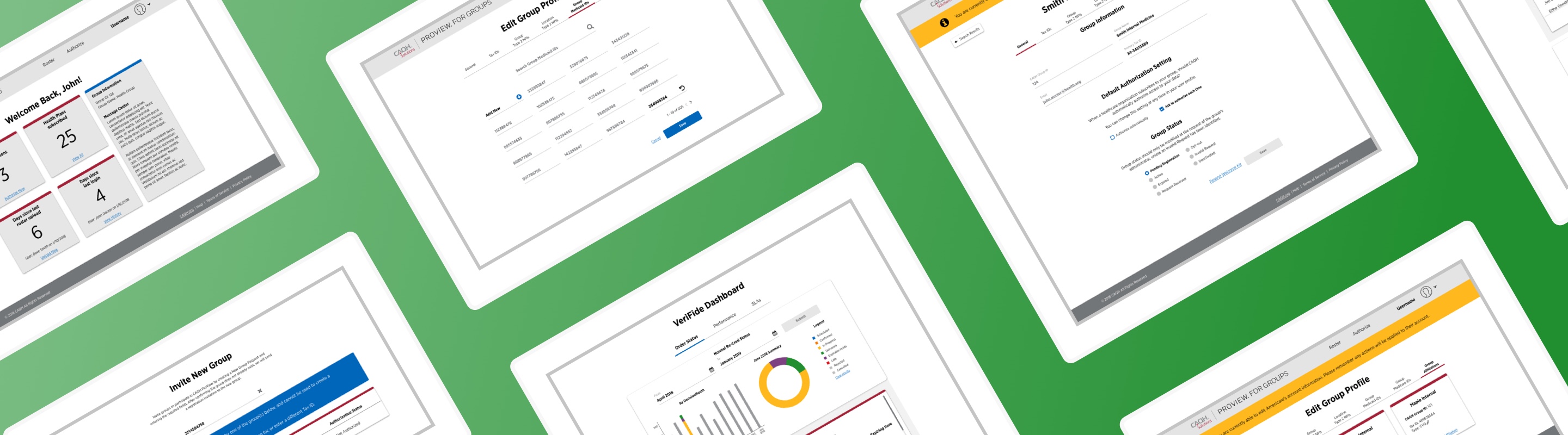
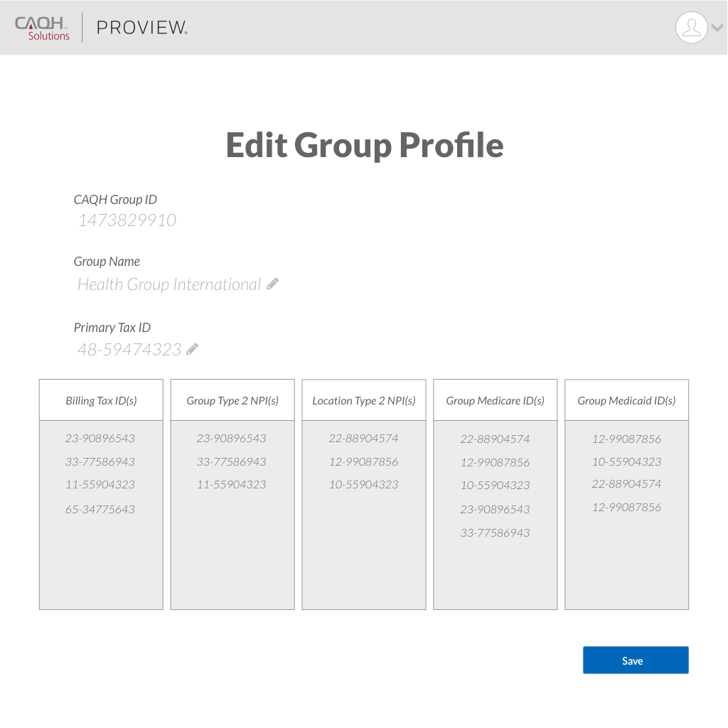
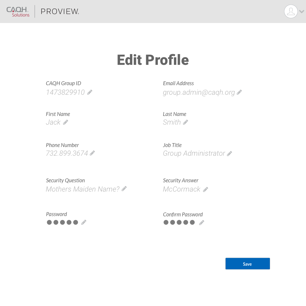
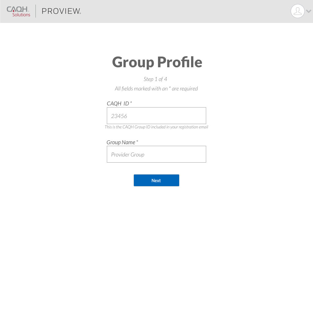
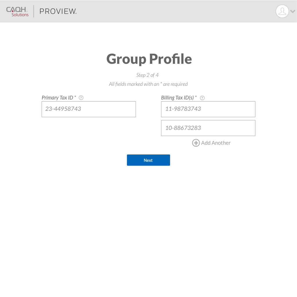
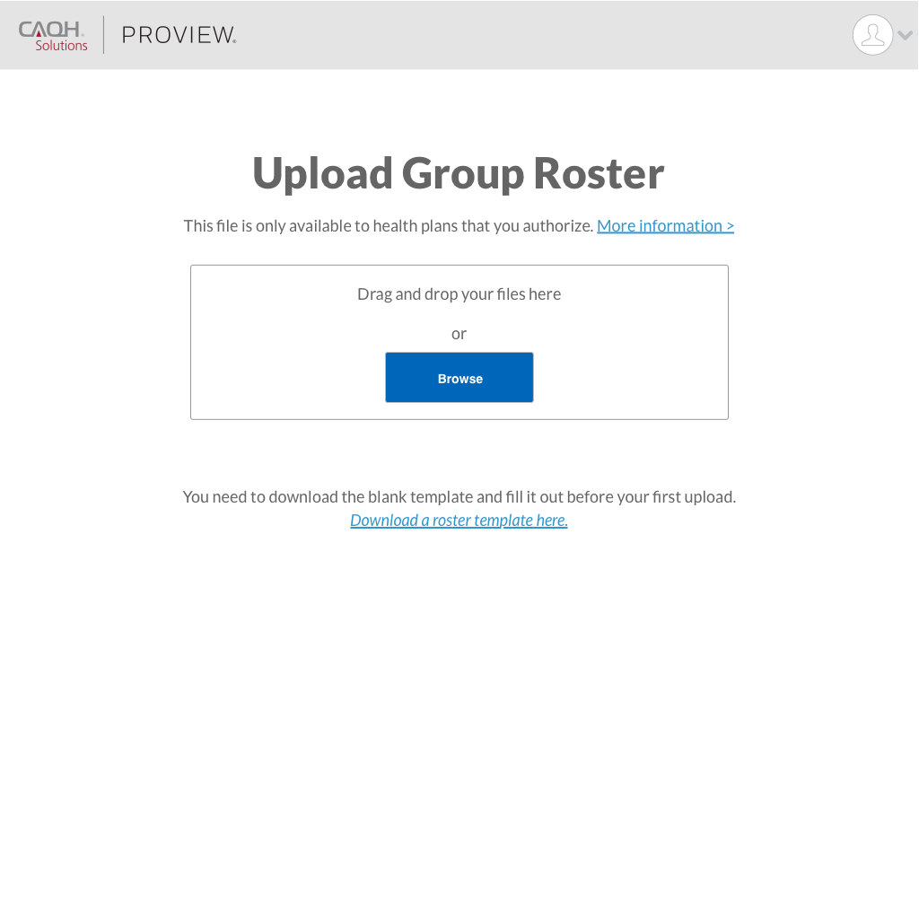
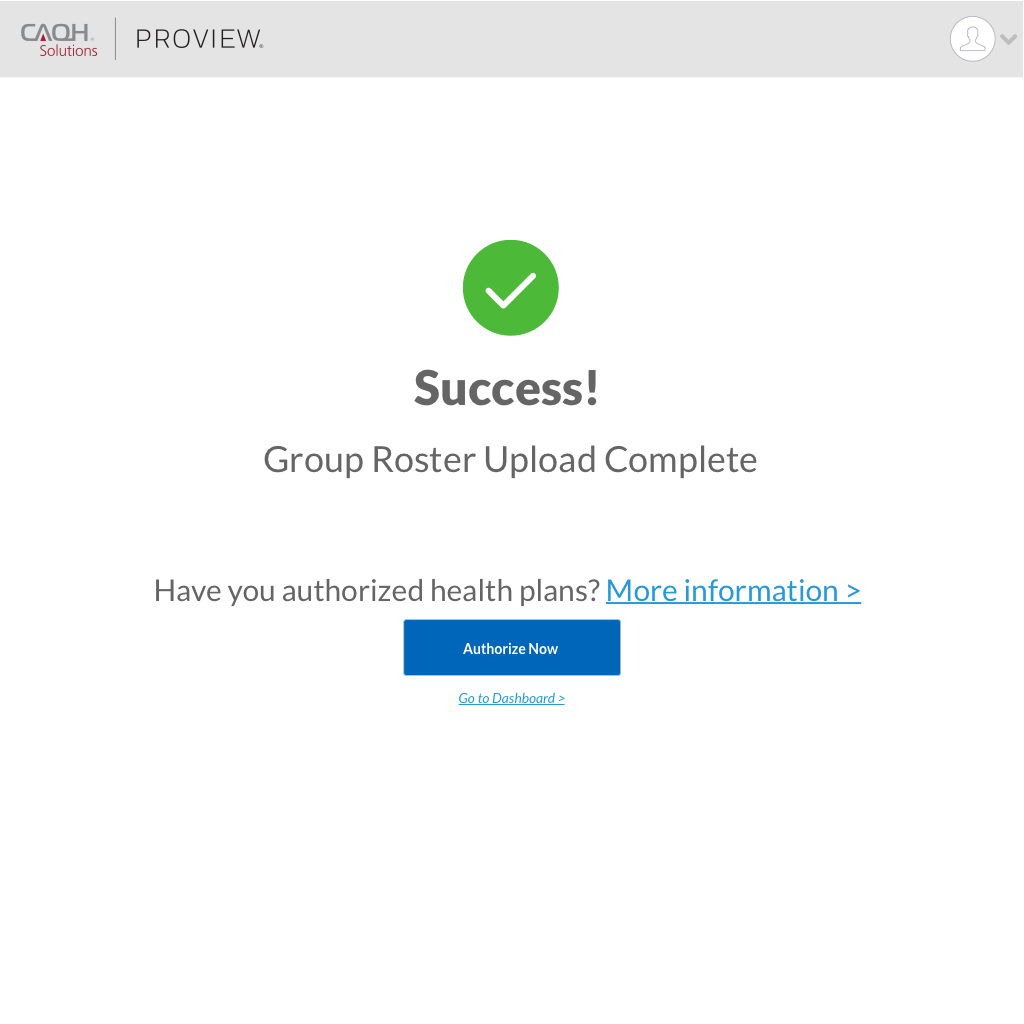
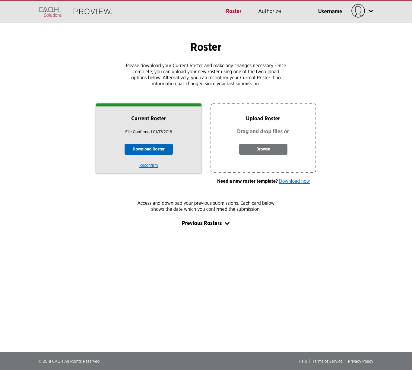
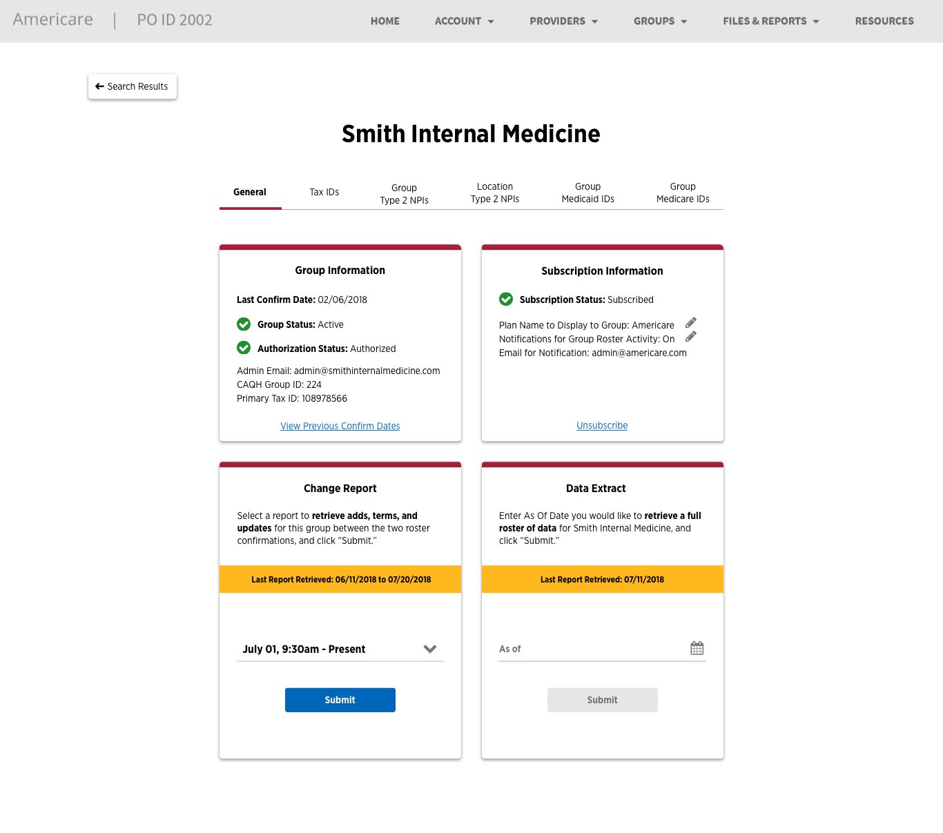
Group Portal


Summary
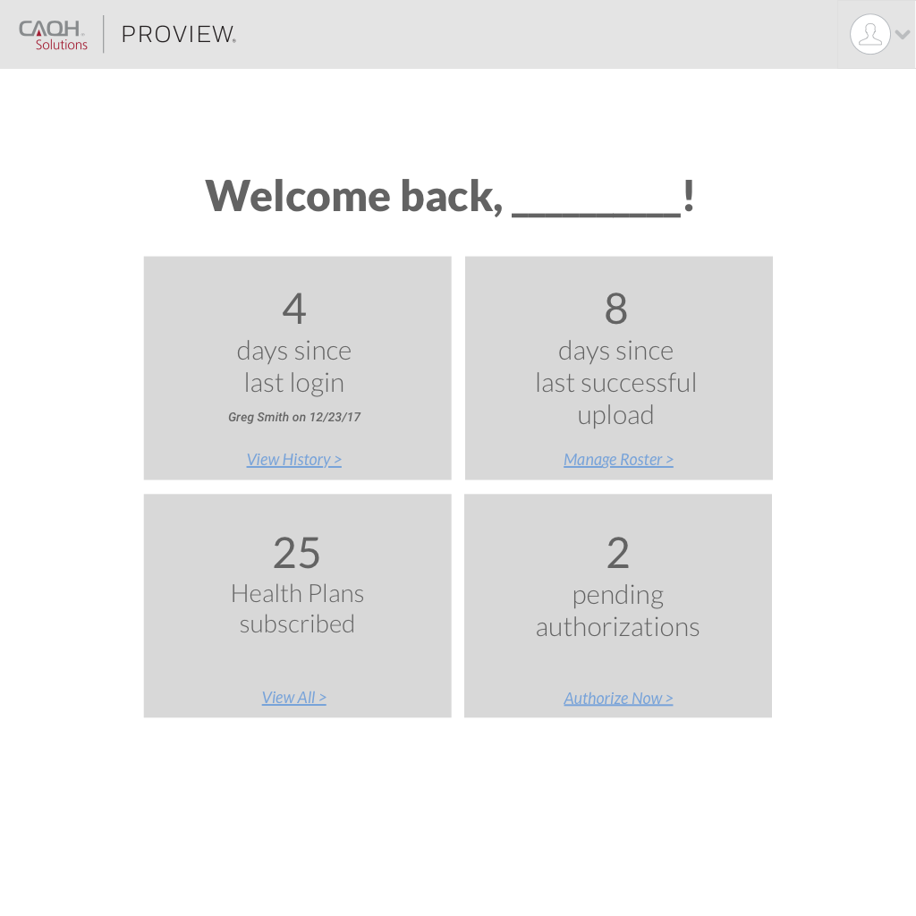
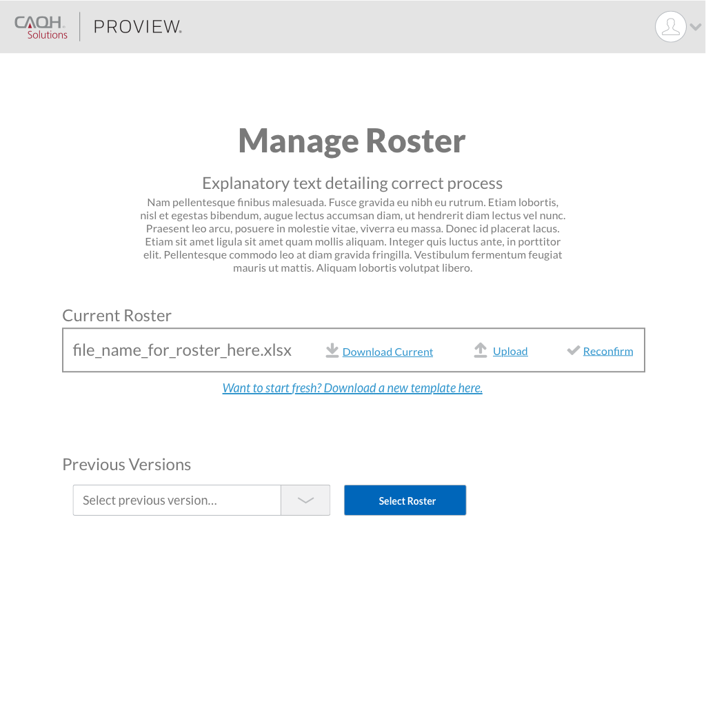
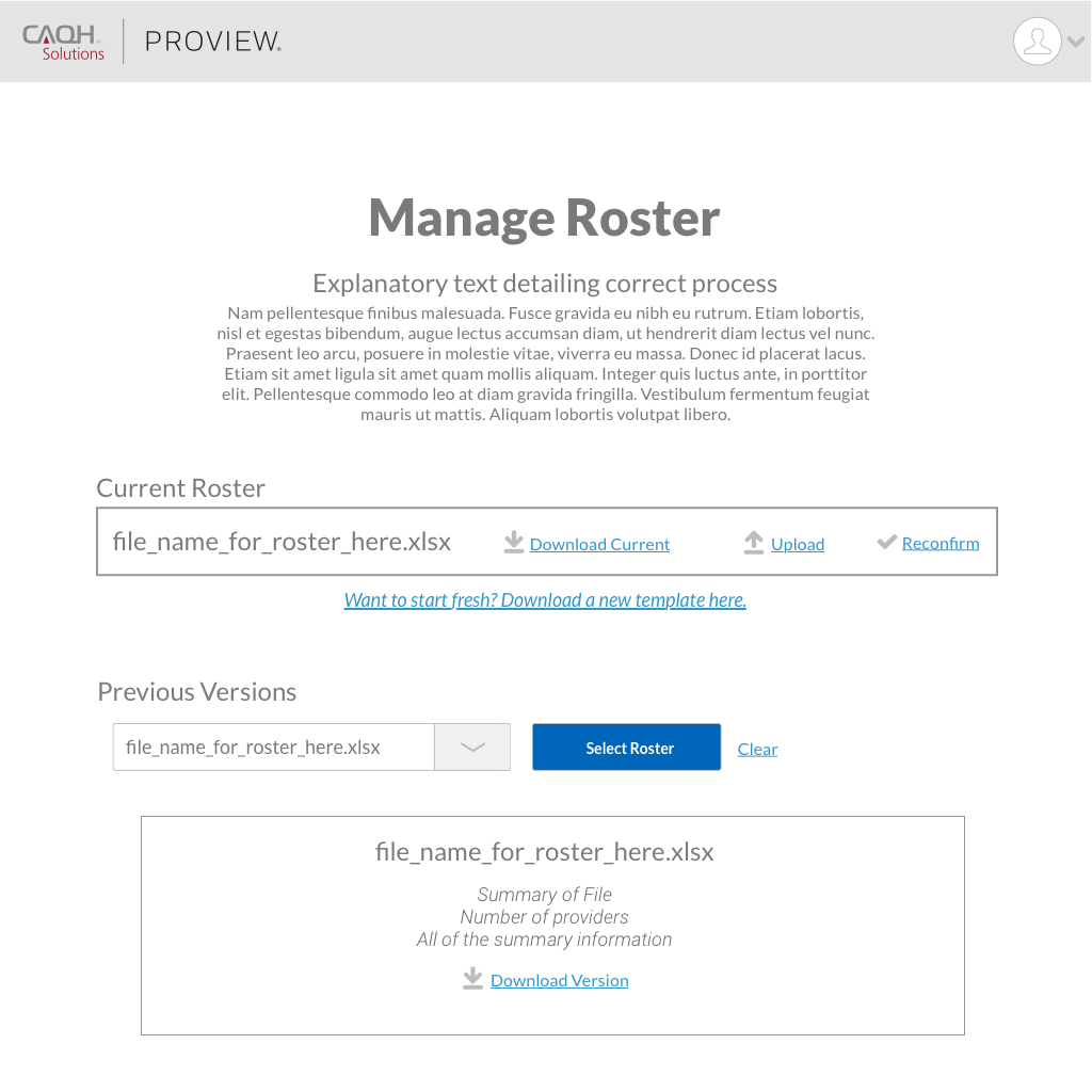
An online web portal that allows group administrators to manage their health plan authorizations and upload their roster of providers.
Process
- Review previously collected research
- Review previously created wireframes
- Sketch and develop user flows
- Create low fidelity wires to validate ideas
- Create high fidelity visuals while developing components for a design system
- Create an interactive prototype in Invision
- Present final solution
Challenges Presented to Us
| Challenges | Solution |
|---|---|
| Groups are maintaining complex excel files for each health plan | CAQH will support the transition to a standard input file format for groups to submit to the system |
| Groups are required to send updated files at varying times to health plans, depending on the contracting requirements | CAQH will maintain confirmed group data for health plans to access on demand |
| Health plans have to manually review and enter the data from the disparate files into internal systems | CAQH will support a standard output file format for health plans to automatically process into internal systems |
| Group data is cumbersome for groups to maintain and health plans to process, which can lead to low quality provider data | CAQH will simplify maintenance and processing to reduce manual error, and utilize discrepancy review and scoring algorithms to improve data quality |
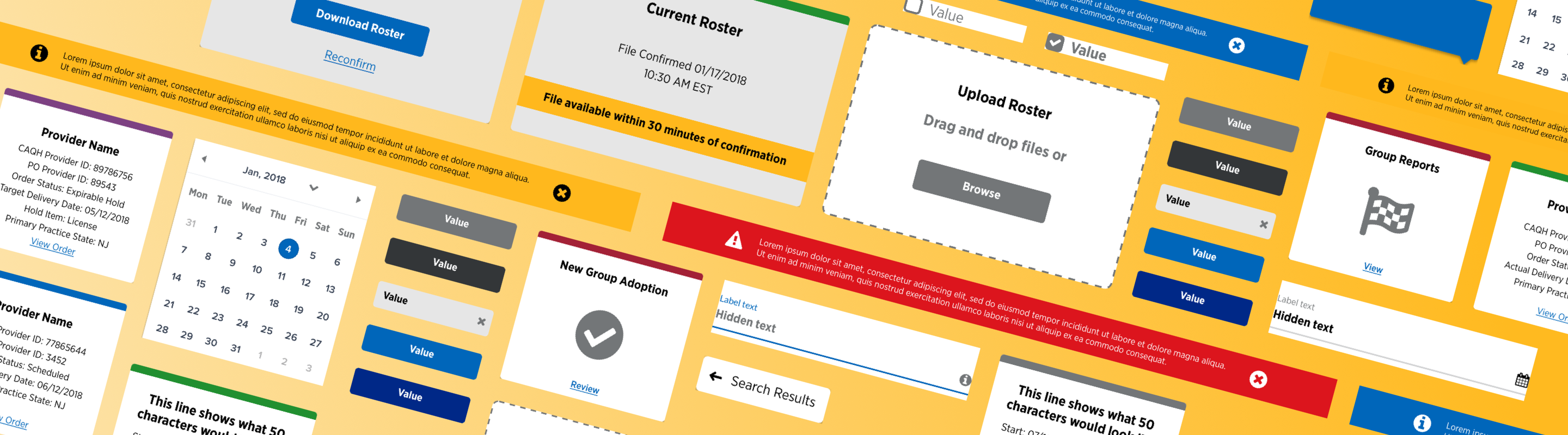
Low Fidelity Wireframes
We started our process by analyzing the research that was already done, looking at the existing wireframes and mockups, and then started to sketch out the user flow. As we started to learn more about the product and ask more questions, we started to identify areas that weren't researched and found out that this project was a lot more complicated than it originally seemed.
There are a few wireframes on the right that were our first attempt at working on the user flow, while maintaining all of the details that the client wanted to keep in the portal. This was a completely new product so we had some room to be creative! The flow below shows our first attempt at organizing all of the information. (Click to expand)
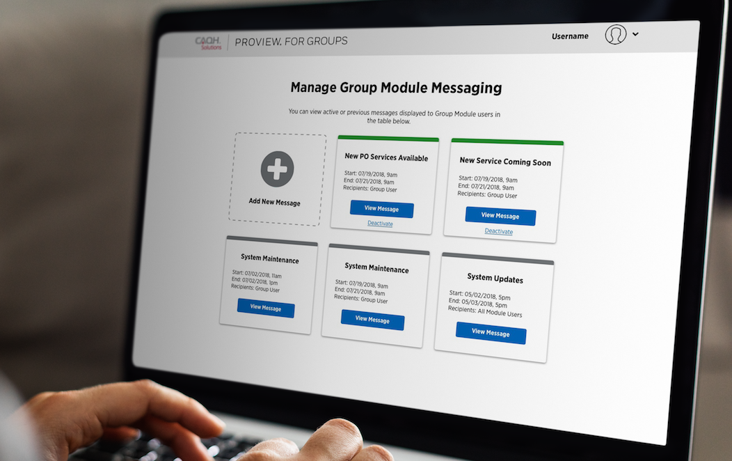
Developing a Design System
While we were working on this project, we had a very small team, consisting of a project manager, a creative manager with visual design experience, a front end developer, and myself, a user experience designer. Because of this, I was given the unique opportunity to work on both the experience of the application as well as create a visual design system based on Material Design thinking and techiques. I personally loved the challenge and getting to work on both sides of the equation.
Keeping it Functional
We knew coming into the project that there were multiple other portals that the client wanted us to work on, so we starting thinking about the design system as a puzzle piece that we could expand across multiple systems for consistency. This was based around a card design that would be simple and responsive and could fit a variety of information depending on the portal.
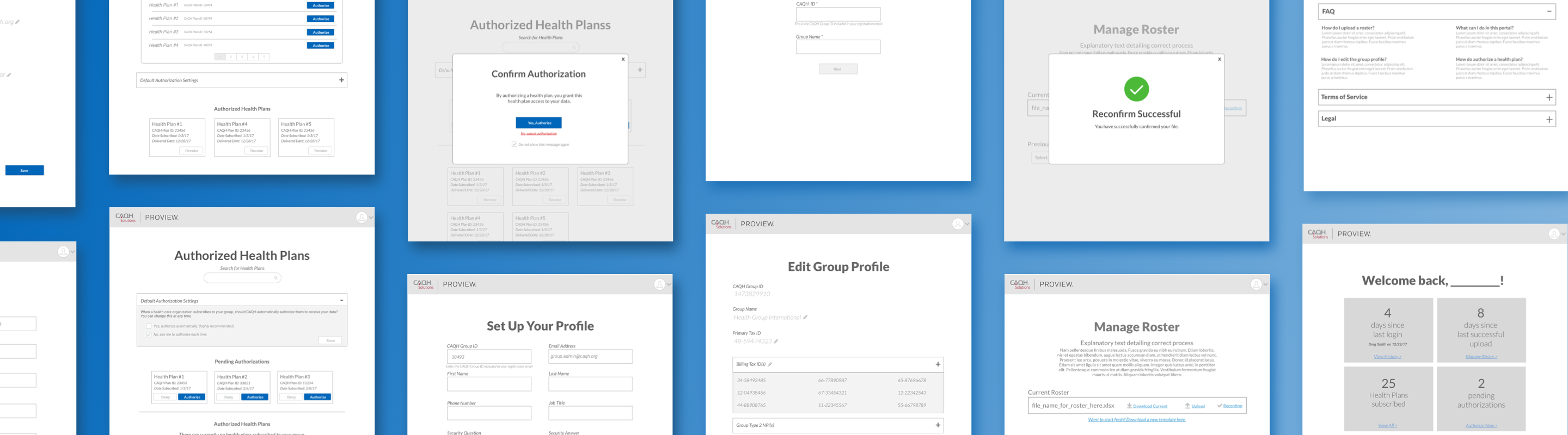
Results
This project launched with great success in the market. We started by rolling out a beta version to about 20 different user groups and asked them to start working with the product, giving us feedback on their experience. The users really enjoyed the card approach that we took. They found them to be a great transition from the tables and excel documents that they were used to working with. The users like the workflows that we developed, and found the application to be simple and easy to navigate. The page layouts were well understood and received great feedback.
Key Improvements
- Effective User Feedback
- Simple Navigation
- Clean Design
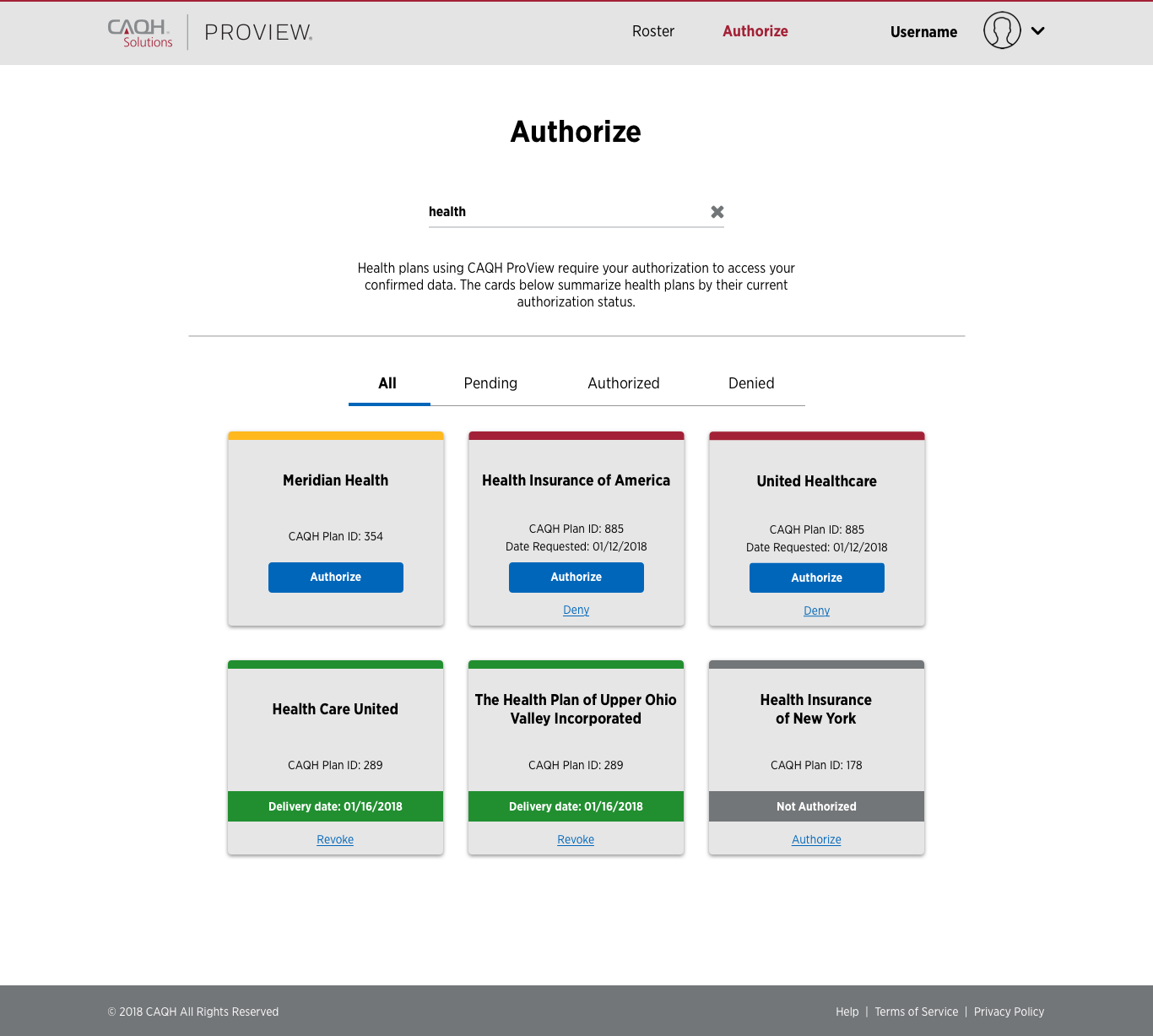
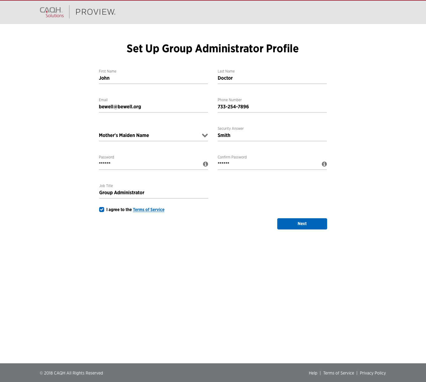
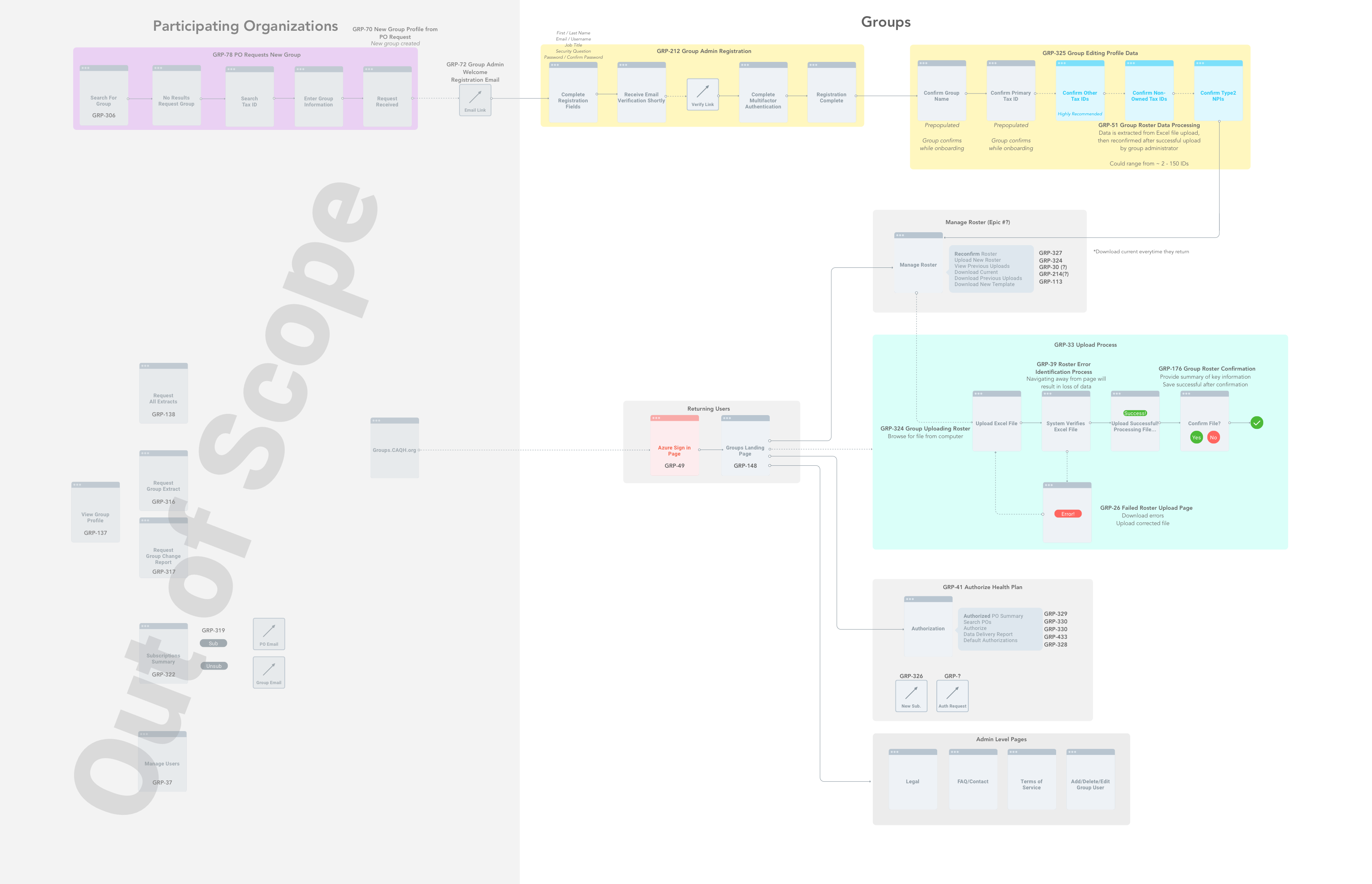
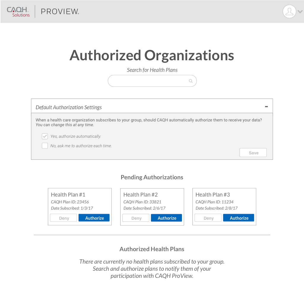
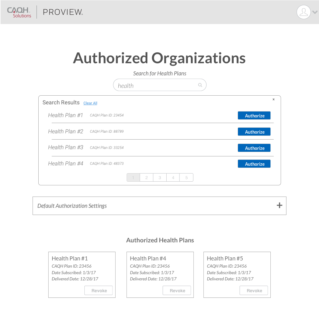
Participating Organizations Portal
Summary
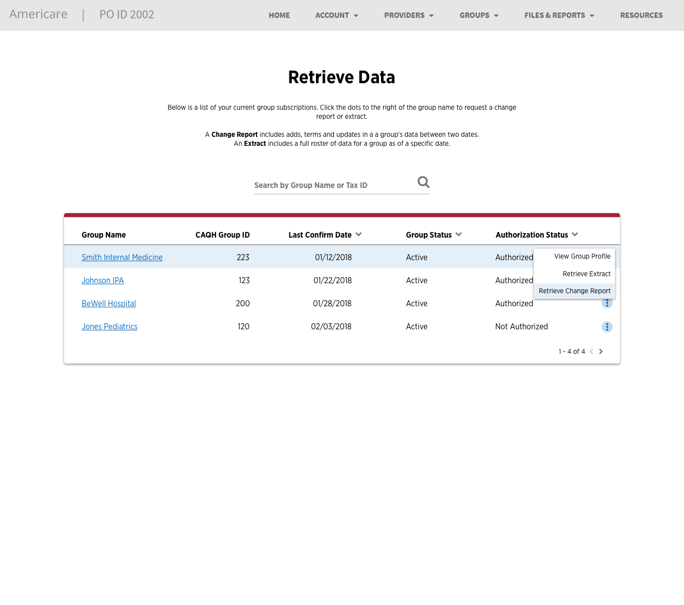
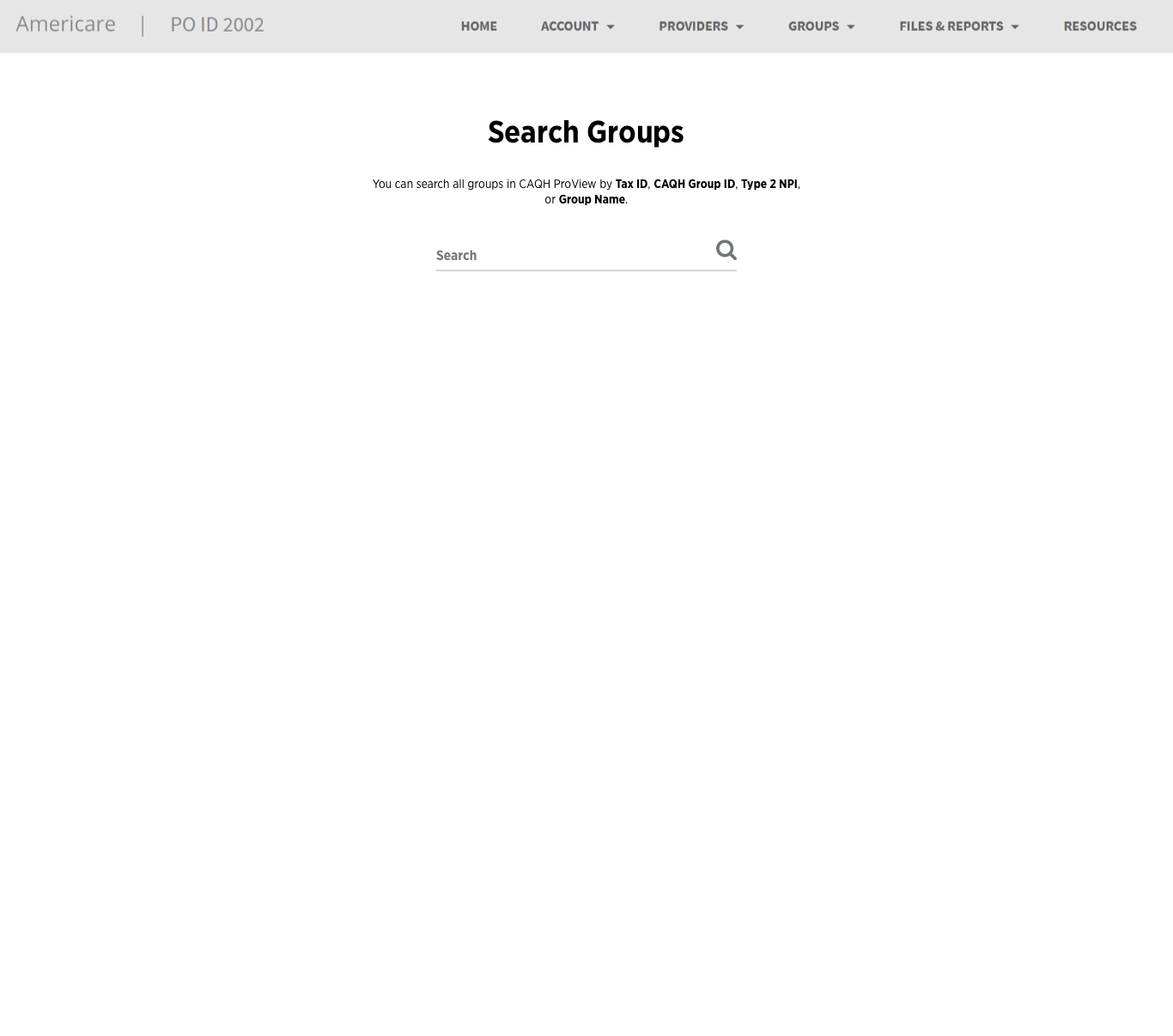
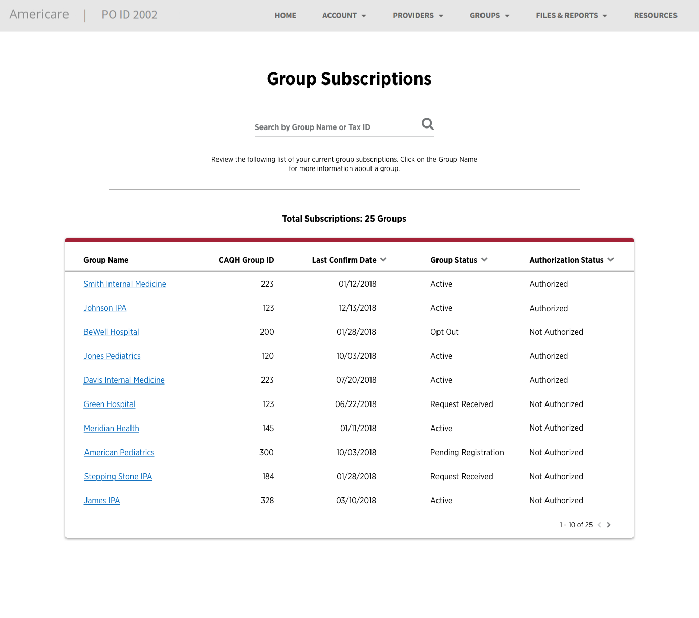
This portal is for health insurance plans that cover individual providers and provider groups. In this tool, users can download group data, invite new groups, and view group profiles. This portal had already had a live version online, so we were working with a redesign, as well as adding new features.
Process
- Review current user flows
- Ideate improvements and new features
- Identify new user flow
- Use defined components from the design system created for Groups (see above)


Initial User Flow Diagram
(Click to enlarge image)
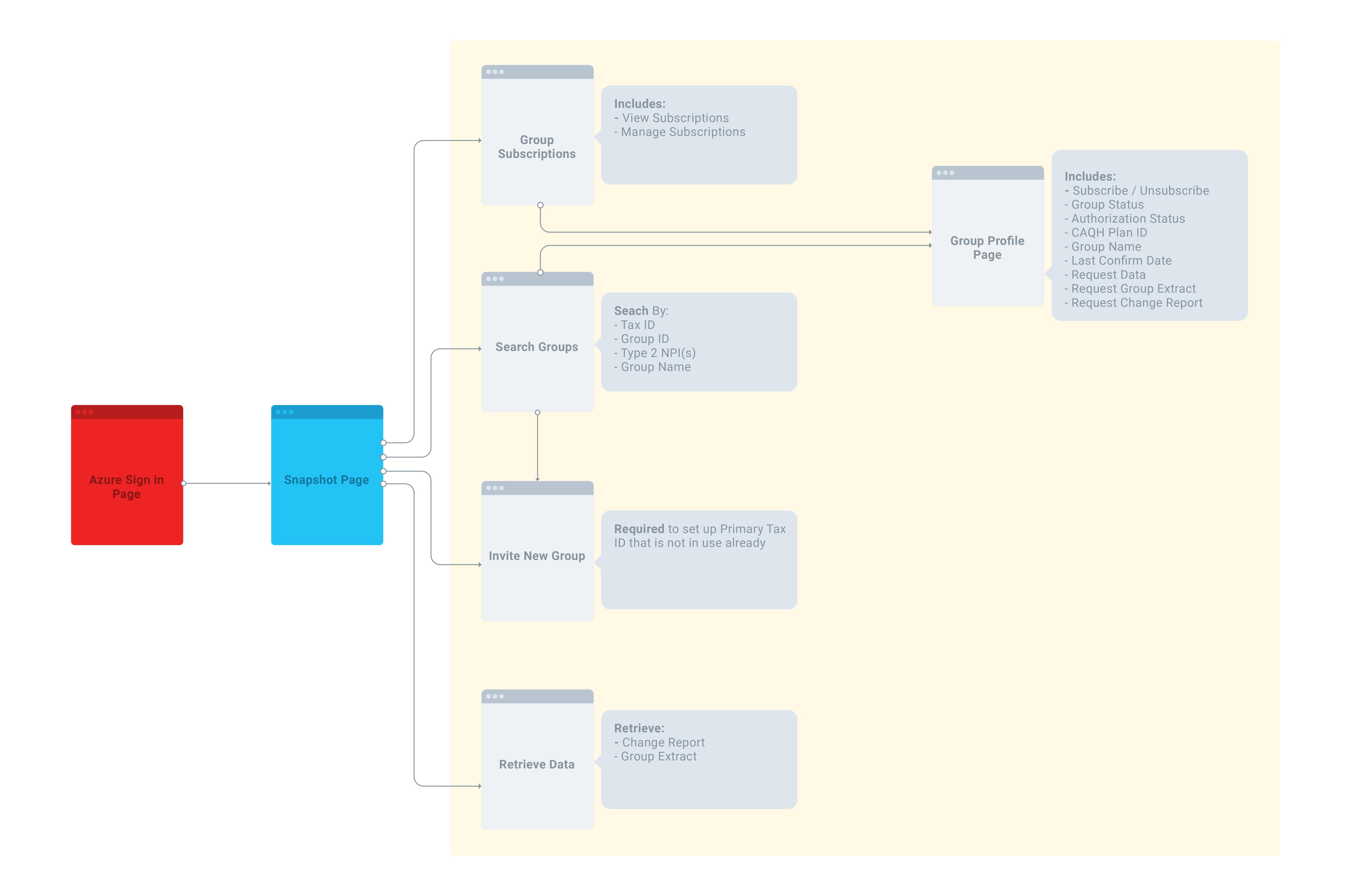
Overall Impressions
The original designs for this portal were confusing. They had information on a page that was unstructured and did not clearly set a path for the user. Our final designs find that clear path and help the user along each step. With clean design and simple actions, users responded better to being able to interpret the provider data.
Key Improvements
- Directed Actions
- Simple Workflows
- Consistent Design
Every page consists of one, and only one, primary action for the path the user will frequently take. This helps give solid direction in the tool and keeps it simple.
We simplified the process by constantly asking why a user needed to complete a task a certain way. By doing this, we were able to combine workflows and make the process simpler.
We developed a new design system for ProView for Groups that we incorporated into this portal. It keeps consistent design and a feeling of familiarity.
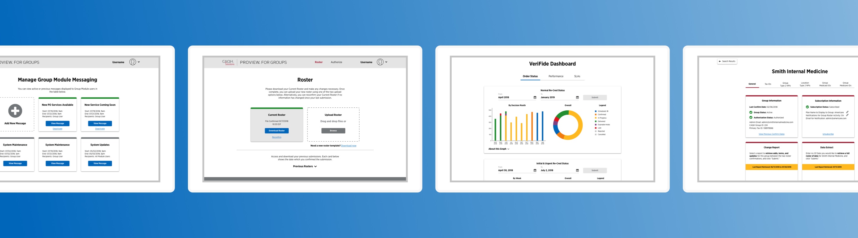
Visual Designs
Here are a few of many final designs for the participating organizations portal. Because we developed a design system for Groups, it became easy to start to fit this system within the components that we had already made. The true test here became testing the viability and usability of the design system we had created. We needed to validate that it fit all of the requirements of each portal, making as few customizations as possible.
Project Overview Presentation
For a more in-depth look at the project and a look at some of the screens, check out this presentation below!