UX Project: My HSA Planner
Company: WEX, Inc.
Location: Portland, ME
Duration: October 2020 - October 2021
View it in the wild: myhsaplanner.com ↗

Overview
Project Summary & Role
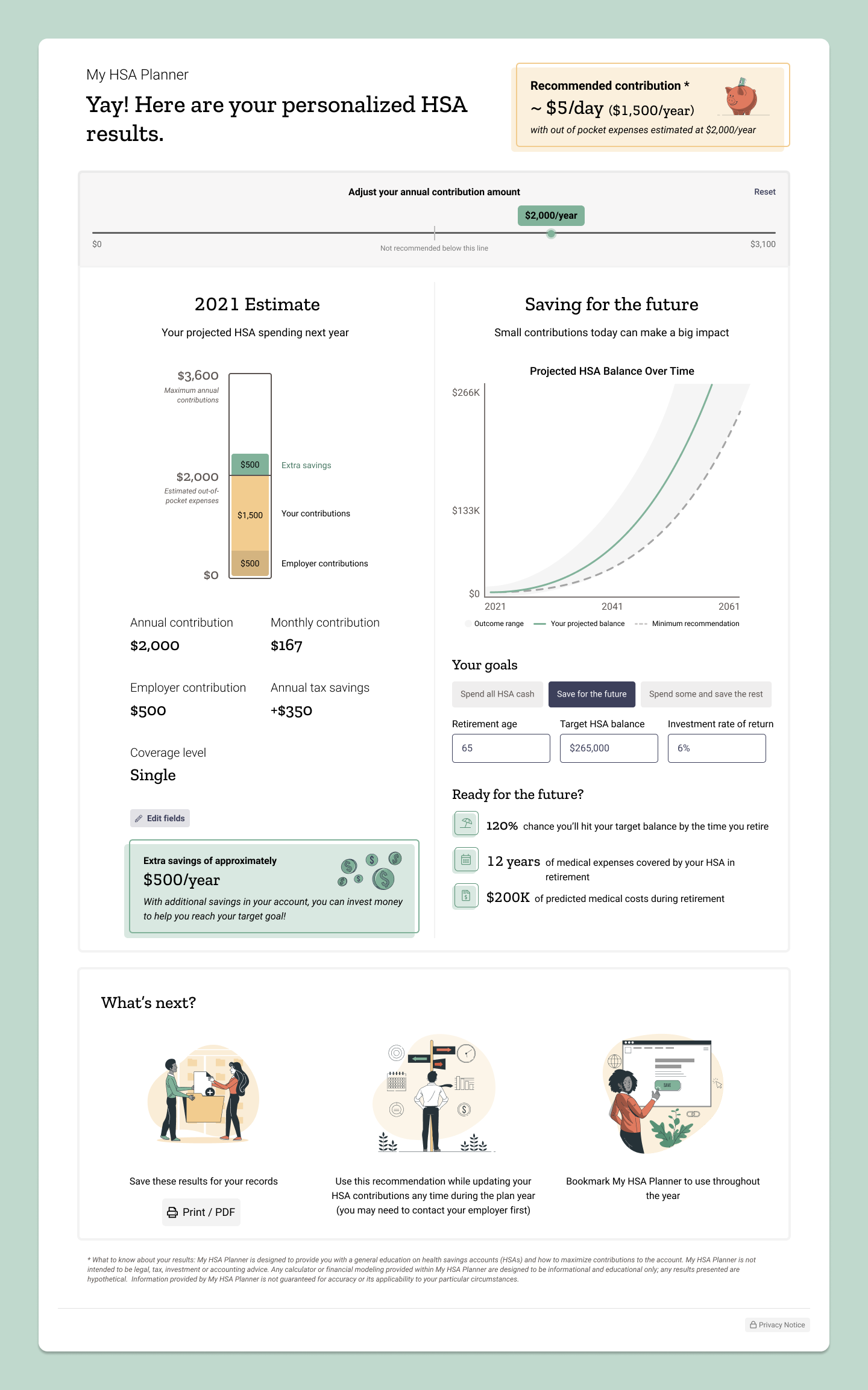
WEX Health’s My HSA Planner, created in collaboration with Picwell, is an AI-powered tool that recommends optimal HSA contributions by analyzing user data (age, health, finances). It offers two versions: a public standalone tool for any user group and an integrated version within the WEX Consumer portal, allowing current participants to access pre-filled, personalized recommendations. Designed to be fully responsive, it ensures an optimal experience across web and mobile.
My Role
As lead designer, I guided the UX strategy, aiming to create a friendly, approachable experience that aligned with users’ financial planning needs. Collaborating with product managers, developers, and a secondary designer, I ensured that technical and product requirements supported our vision for a simplified, engaging user experience.
Problem & Objectives
Challenge
Consumers often struggle with knowing how much to contribute to their HSAs, resulting in missed tax benefits and under-preparedness for healthcare costs. My HSA Planner fills this gap, offering personalized, actionable recommendations.
Business Impact
By encouraging optimal HSA contributions, this tool supports increased deposits, benefitting WEX Health’s financial goals, enhancing employer engagement, and aiding employees in making better-informed health benefit decisions.
User Need
For consumers, My HSA Planner addresses the need for clear, personalized guidance on HSA contributions, enabling informed decisions that support long-term financial health.

The Process
Discovery
Research-Based Approach
The discovery phase centered around a research-driven approach to ensure the final design would resonate with users and meet their needs. Our approach included several key activities:
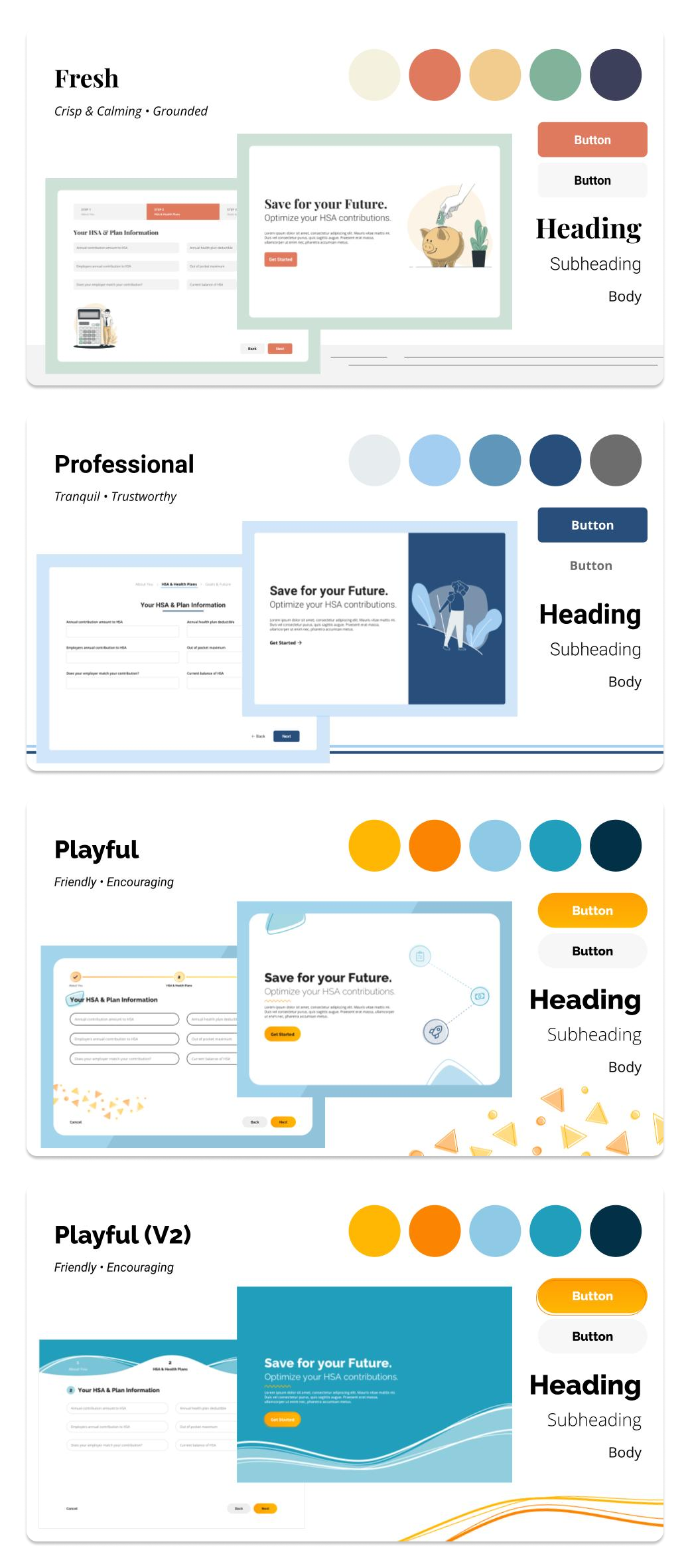
- Moodboards: We created moodboards to explore visual directions and design aesthetics, testing for a warm, friendly, welcoming, and familiar tone. The goal was to emphasize the core message of saving while creating an approachable experience for users.
- Usability Testing: We conducted usability tests to ensure the tool’s flow was intuitive. The focus was on minimizing friction by reducing unnecessary questions and identifying any pain points in the process. We also observed how users interacted with the recommendations to ensure they were actionable and easy to understand.
- Focus Groups: We held focus groups with voluntary participants to gather qualitative feedback on early concepts and prototypes. These participants were given a first look at the tool to understand how they would interact with it, providing valuable insights into user preferences and expectations. This helped us validate design choices and refine the user experience.
User Personas and Journey Maps
From a library of 14 user personas across three major groups—consumers, employers, and admins—we focused specifically on the key consumer personas for this project. These personas represented different user segments, helping us tailor the experience to the needs of younger HSA holders, who were a primary target for the tool. In addition, we developed journey maps to visualize critical touchpoints and opportunities to guide users through the tool’s features and benefits, ensuring the design addressed their most pressing needs.
Stakeholder Collaboration
In parallel with user research, we worked closely with product management, technical teams, and our third-party partner, Picwell, to align on the tool’s goals and technical requirements. These discussions emphasized the importance of integrating AI-powered personalization and providing tailored recommendations to users based on their unique financial and health profiles.
Ideation and Strategy
Concept Development
We began the ideation phase by exploring visual directions through moodboards, setting the creative tone for My HSA Planner. The goal was to establish a friendly, approachable, and comforting aesthetic for a financial planning tool, making it more inviting for users. Once the mood and style were established, we moved into wireframing, developing early concepts that would serve as a basis for collaboration with Picwell and usability testing.
Wireframes and Usability Testing
Wireframes were shared with Picwell to ensure technical feasibility and to validate the AI-driven logic and data requirements. Usability testing was conducted with real users to measure how efficiently they could complete tasks, identify pain points, and ensure that the information being collected was comprehensive and accurate enough to feed into the AI engine. This helped refine the questions we asked, as we wanted to keep the process streamlined without compromising the accuracy of the AI’s recommendations.
Design Direction & Key Features
Several key features set My HSA Planner apart from other tools in the market:
- Leveraging Picwell’s API for Accuracy: We asked fewer questions to gather more accurate data, relying on Picwell’s extensive claims data and machine learning algorithms to enhance the quality of the recommendations.
- AI-Driven Personalization: The tool uses AI to analyze claims data from millions of people across the country, identifying individuals who are most similar to the user. This "people like you" approach allows the tool to predict the user’s health care utilization more accurately, factoring in their personal preferences such as their tendency to be a saver or spender, and their financial risk tolerance.
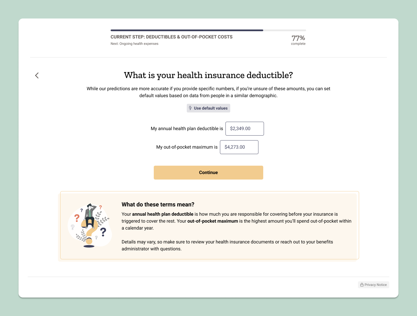
- Engaging, Non-Linear Flow: Rather than presenting users with a traditional form, My HSA Planner uses a "Mad Libs" style approach. It breaks down the information into small, digestible pieces, paired with engaging messaging that guides the user through the process. This approach was tested and well received for its ease of use and its clarity in communicating what information was needed.
- Contextual Support: To ensure users understood the information being requested, we included helpful interstitials, pop-ups, and “what you’ll need” messaging. Feedback from usability testing confirmed that these additional features were valuable in guiding users through the process.
- Inclusive Design: The tool was designed with inclusivity in mind, ensuring that it wasn’t just about maximizing HSA contributions but about meeting users where they are. This inclusive design ensured that users of varying financial literacy levels could engage with the tool effectively.
- Data-Driven Customization: The AI not only personalizes recommendations based on user data but also factors in broader patterns from similar individuals, making the experience both highly personalized and deeply informed by data.

Design Execution
Simplifying the User Experience
Our design execution focused on making the process of entering information as simple and intuitive as possible. By reducing the number of questions asked and providing clear messaging throughout, we aimed to minimize cognitive load while ensuring the tool’s effectiveness. We also tested the time it took users to complete the tool and gathered feedback on whether they felt they would have dropped off earlier in the process. This helped us gauge both user engagement and tool efficiency.
Interactive Prototypes
We created interactive prototypes in Figma for both web and mobile responsive versions. These prototypes were tested to ensure the tool was easy to navigate and functional across different screen sizes. We focused on four breakpoints for screen sizes: web, small web, tablet, and mobile. Testing allowed us to validate the interactivity of the tool and optimize the experience for various devices. Feedback from users confirmed that the tool was easy to use, no matter the device.
Collaboration & Handoff
As the lead designer, I collaborated closely with our development team, using Figma to create final deliverables. We used an early version of Dev Mode to ensure the development team had access to accurate specs and design details. This streamlined the handoff process and allowed for smoother implementation of the final design.

Key Findings & User Feedback
Through usability testing and user feedback, we gathered key insights into how the tool performed and how users felt about the experience:
- Ease of Use: Users consistently described the tool as easy to use on both web and mobile, with the process being quicker than expected.
- Personalized Recommendations: Users felt there was enough information on the personalized recommendations page to help guide their HSA decisions. The inclusion of educational content was particularly appreciated, as it helped build trust in the system.
“Really well done—wish my employer had something this easy for HSA contributions.”
- User Testing User
Results & Impact
Post-launch, My HSA Planner has been well-received across both web and mobile platforms. The tool performed exceptionally well in usability testing, and users reported completing the process more quickly than expected.
Key Findings include:
- Efficiency: Users consistently felt that the tool was fast and intuitive to use, with completion times shorter than anticipated.
- Engagement: The tool's interactive, AI-driven recommendations kept users engaged throughout the process, with high satisfaction rates on both web and mobile.
User Feedback
The feedback collected during testing has been overwhelmingly positive. Here are some standout user quotes that showcase the tool's impact:
- Ease of Use: Users found it fast and straightforward, with many completing the tool faster than expected.
- Personalized Recommendations: Users felt there was enough information on the personalized recommendations page to help guide their HSA decisions.
- Educational Content: Content that explained the reasoning behind questions increased user trust.
These insights confirm that users found the tool both user-friendly and informative, reinforcing the design direction and the inclusion of educational content.

“Everything was explained really well…it was very intuitive where I wanted to click.”
- User Testing User
Business Impact
- Increased HSA Contributions: By providing personalized, data-driven recommendations, the tool empowers users to make informed decisions, potentially increasing HSA deposits.
- Employer Engagement: Employers benefit from helping their employees navigate the complexities of health benefits, improving overall decision-making during open enrollment periods.
- Revenue Generation: Higher HSA contributions translate into more revenue for WEX Health and its partners, demonstrating the tool’s value in achieving financial goals.
Lessons Learned
- Simplicity Is Key: Users responded positively to the streamlined approach, with the "Mad Libs" style of the questionnaire and helpful educational content. This feedback reinforces the importance of reducing complexity in financial tools.
- Personalization Is Powerful: The AI-driven recommendations based on "people like you" was a major differentiator. Users appreciated the tool’s ability to consider their unique situation and provide tailored advice.
- Responsive Design Matters: Ensuring the tool was optimized for both mobile and web devices was crucial for engagement, as users reported high satisfaction with the mobile experience.
- Educating Consumers About the Value of HSAs: A major lesson learned was that consumers do not fully understand the full power of HSAs. These accounts are not just for saving—they can help protect against unexpected healthcare expenses. The tool helped educate users on how they can use their HSAs as an extremely valuable savings tool, allowing them to see the benefits more clearly.
“Fun to use; going through the whole thing was very easy.”
- User Testing User